Drilldown Multi-Level Side Mobile Menu
In this documentation you will read how to install and use our module ‘Drilldown Multi-Level Side Mobile Menu’ developed for PrestaShop.
You can also watch the video we have made for you if you are not a reading type.
Documentation Content
- Installation
- Configuration
- Configuration Section I: Display Settings
- Configuration Section II: Menu Bar settings
- Configuration Section III: Top Icons Settings
- Configuration Section IV: Top Icons Colors
- Configuration Section V: Menu Items Colors
- Configuration Section VI: Social Icons
- Configuration Section VII: Social Icons Colors
- Configuration Section VIII: Hide Theme Menu icon
- Editing the menu
- Displaying the menu toggle button (hooks)
- Template files you might want to change
- Module Translation
- Contribute
Installation
- Upload it via modules- >add a new module->choose a file (v.X.X.X-zomlmm.zip)->upload this module via PrestaShop Module Manager or unzip and upload zomlmm folder to your root/modules folder via FTP
- Search the module under Modules type zomlmm or Drilldown Multi-Level Side Mobile Menu to find it quick.
- Click install and then configure it
Keep in mind!
Acceptable color values are hex code. You can search the internet for hex code to aid you or click on the  to aid you choose a color.
Configuration
Here you will find 8 sections, each section configures different part of the module.
To configure the module, you will have to navigate your self from the administrative(back office) menu Modules -> Module Manager and search for our module by typing ‘Drilldown’ or ‘zomlmm’ with out the single quotes and pressing enter, then click on the configure button.
Configuration Section I: Display settings
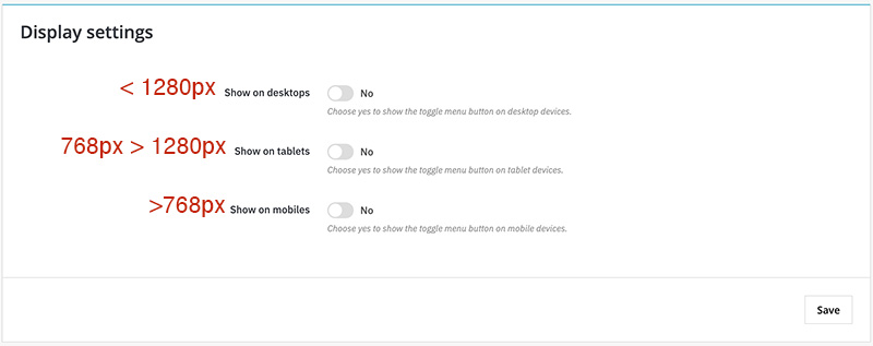
In this section you choose on which devices the button toggle menu will appear or not.
In the image you will see the css media queries break points, if you know what those are, if you don’t that is alright you do not need it anyway it is just information.
Configuration Section II: Menu bar settings
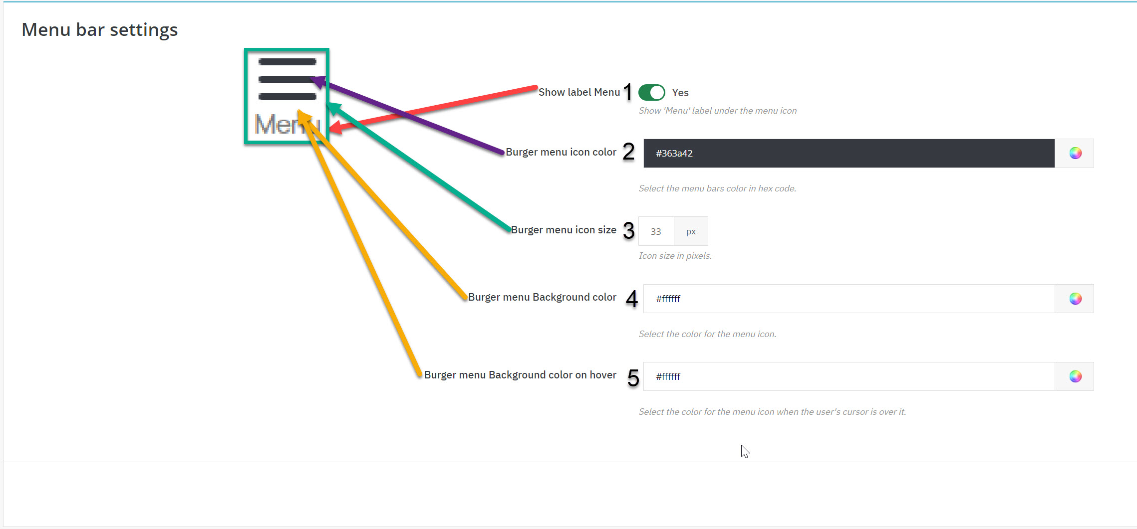
These settings are all about the toggle open/close menu button.
- simply hide or show the ‘Menu’ label under the hamburger menu icon.
- change the color of the hamburger menu icon.
- changes the size of the hamburger menu icon 33 is recommended. According to the size you select the menu label size is also going to change!
- background color in hex code for the place that the blue line is indicating at the image above.
- background color on hover state in other words when the user’s cursor is above the burger menu icon.
Configuration Section III: Top Icons Settings
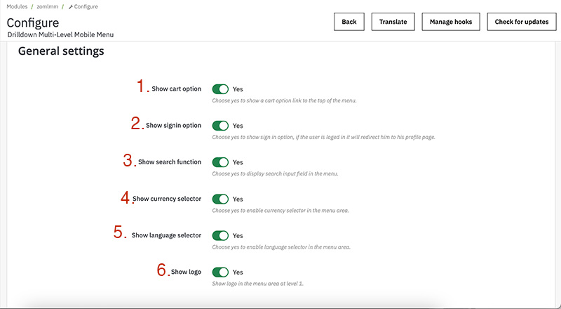
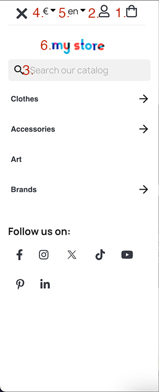
As shown at the images each of the options shows the particular option at the side menu when it is open.
- choose ‘Yes’ to show the cart (bug icon) or ‘No’ to not show it
- same as 1, Yes/No to show or not the sign in/myaccount option(user icon), if the customer is signed in and clicks it, he/she will be directed to his/her account age, if the customer is not signed in will be directed to sign page.
- same as 1, Yes/No to show or not the search field in the side menu.
- same as 1, Yes/No to show or not the currency selector so that the customer can change currency
- same as 1, Yes/No to show or not the language selector so that the customer can change language
The positions of this elements are fixed as shown and if you choose yes they will be displayed as shown in the image, however in the image all options are enabled, if we choose not to show the currency selector the cart will not be so close at the end of the side menu it will be closer to the close menu button.
Configuration Section IV: Top Icons Colors
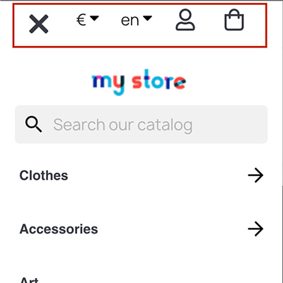
In this section is all about the colors of the icons at the top of the menu, they are highlighted on the image above.
There are 4 options.
First option is for the color of the icon.
Second is for the color of the icon but in a hover state, in other words when the cursor is on the icon, what color will change to.
Third is the background color of the icon.
Forth is as the second one but concerning the background color of the icon on a hover state.
A good selection is the color that your shops uses at your texts and for a hover color the main color of your logo, as for the background you can keep it simple with the main background color that your shop is using usually it is white or black for dark themes. Finally know that if you choose the same color for the icon color and the background you will end up with a colored rectangle that the icon is not shown.
Configuration Section V: Menu Items Colors
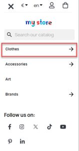
This section is all about the colors and font of the menu items like the one we highlated for you on the image above!
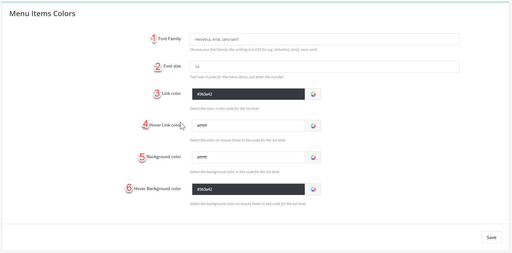
1 and 2 concerns the font of the menu item. On one you can enter the font of your menu or the font family you like or leave it as the default value we have entered from you that is using system fonts.
Number too has to do with the font size and the metric is in Pixel(px) you can change it as you like, our recommended value is 14
You can leave blank number one and number two enter 0 value, and the menu will get the styles of your theme!
Number 3 changes the color of the text in the menu item and number four the background color of the menu item.
Now 5 and 6 changes the colors as 3 and 4 but on a hover state, in ohter words when the user’s cursor is over the menu item.
Good choices are to get the colors of your logo and use them here but try to keep it simple so it can be readable.
Configuration Section VI: Social Icons
Now for this section is quite simple but few things should be mentioned.
First for the Show Social Links option, if you choose ‘No’ then no social links will be displayed at the menu, if you choose ‘Yes’ the links will be displayed but only those that have values.
For e.g. if you enter the link of you facebook page and all others are blank only the Facebook icon will be displayed at the menu.
Configuration Section VII: Social Icons Colors
This section is quite the same with the section V and has to do with the colors of the social icons, the first two are about the icon color and the background color, the third and fourth is about the icon color and the background color but on a hover state, meaning when the user’s cursor is over the icon.
Configuration Section VIII: Hide Theme Menu icon
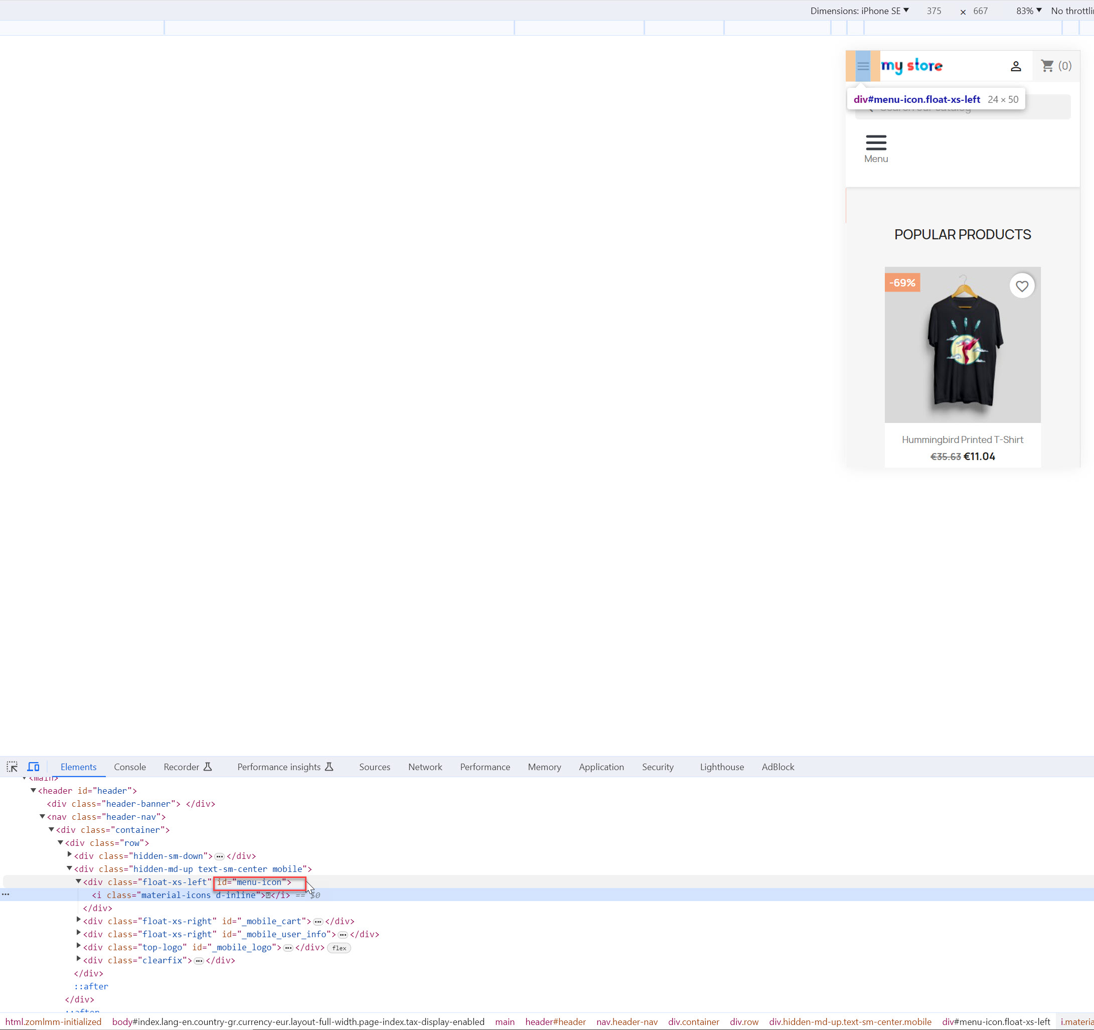
In this section you can hide a menu burger of a current menu you have but you dont want to disable or unistall it.
You will have to add the class or ID of the menu element in order for our module to hide it via CSS.
Right click on the menu you want to hide and click inspect, then get the id or css class and enter in the field.
ID is prefered as they are most ofter unique so they can not interfere with other html elements.
A css class you might enter may be used from many elements so be carefull because from this setting you might hide other elements too!
Editing the menu
Now we are at the juice of this documentation!
How do you create, edit, delete menu items and there options.
First of navigate your self from the back office navigation menu Design -> Mobile Menu
One button and two columns are displayed.
The column on the left shows the menu items that you currently have, the column on the right shows a form that is responsible to creat or edit a menu item.
Take your time and examine the following image which displays varius functions
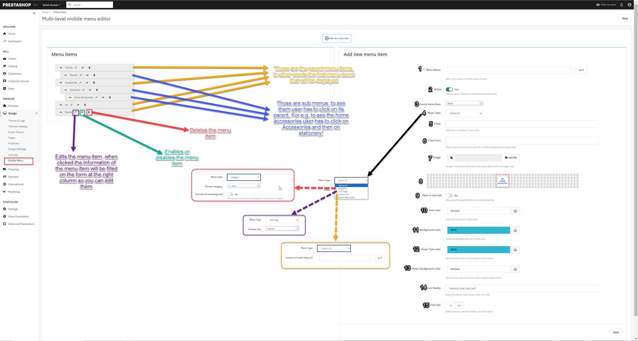
The left column creates the tree of you current menu items like the image above is inticating.
You can drag and place each item at which ever order you want.
You can even place it as a sub item if you place it under a menu item and little bit to the right.
You can edit, delete and disable/enable each item from the icons that each item has.
The pensil icon edits the menu item and all of its info will be filled at the form on right column for you to change them and save the changes.
The check icon indicated that the menu item is active if you click it a X icon will be placed instead of the check icon indicating that this menu item is not active.
Thr bin icon deletes the menu item and refresh’s the page.
Now about the form
- Is the name of the menu item and this name is shown at the front. You have to enter a name for each language you use!
- Displays or not the menu item, it is usefull if you want to keep it inactive for another day to activate it or simply deactivate a menu item fast.
- You can select the parent menu item. If you select none the menu item will be displayed at the first level of the menu or you can choose from one of the list that has all the current menu items you have stored to place it as a sub option
- this is the most crutial option, what link type is going to be the menu item.
- Home Url navigates the user at your home page
- Category option shows two more options when you select it, the first is to choose which category you want for the user to navigate when he/she clicks this menu item and the second is to add all its subcategories as sub menu items to help you save time!
- you can enter a class name for this menu item if you want to pass some style effects, leave it blank if you do not know what a css class does
- class icon, is to enter a class font icon to show it next to the name of the menu item, like font awesome for e.g. fa fa-tag
- you can upload an image to show it next to menu item, maximum size of images allowed are 50px width and 50px height, also acceptable types are png, jpg, jpeg and gif
- If you choose yes when the user clicks on the menu item a new tab will be opened instead of redirecting him/her
- Overides the style of the text color that you have entered on the module configuration page, only for this menu item.
- Overides the style of the text color on a hover state that you have entered on the module configuration page, only for this menu item.
- Overides the style of the background color that you have entered on the module configuration page, only for this menu item.
- Overides the style of the background color on a hover state that you have entered on the module configuration page, only for this menu item.
- Overides the font family that you have entered on the module configuration page, only for this menu item.
- Overides the text size that you have entered on the module configuration page, only for this menu item.
To delete an image of a menu item, click on the edit button of the menu item, on the form the image will be displayed and under it is a bin icon, click on the bin icon to delete the image!
Displaying the menu toggle button (hooks)
Now this is important as it will help you position where you want the menu toogle button.
First lets list the display hooks that our module is using and a few words for them!
- displayAfterBodyOpeningTag (crutial hook do not remove it! as it is responsible to generate the side menu)
- actionFrontControllerSetMedia (crutial hook do not remove it! loads the JS and CSS files that the module needs to function and styled)
- displayTop (this hook is choosen by us as it is a good hook to display the hamburger menu toogle button for the PrestaShop default theme!)
- displayMultiLevelMenuNavBar (our custom hook, if you have the knowledge you can place it where ever you like, more info for it bellow)
Our module uses the widget interface of PrestaShop, so you can choose any display hook you want and the hamburger toogle menu bar will be displayed there.
Then only display hook that is not going to display the toggle button is the displayAfterBodyOpeningTag and that is beacause it is responsible for the side menu.
Navigate your self from back office Design -> Positions and click on the top right corner the button ‘Transplant a module’
On the form first choose our module and then on the second selection choose the hook that you want to display it, avoid the displayAdmin* and displayBackOffice* hooks those are for the backoffice!
You can select any display option you like, we will list some of them that are usually the ones you want.
- displayTop
- displayNav
- displayNav1
- displayNav2
- displayNavFullWidth
- displayTopColumn
Finally our module creates a custom module for you to use it if you have the knowledge.
You can use the following code to a tpl file and place it where ever you like!
{hook h=’displayMultiLevelMenuNavBar’}
Template files
Important template files that you might need to adjust for your theme if you possess the knowledge of html, smarty and bootstrap.
Be cautions that changes on these files can result to a malfunction of the module. (if this misfortune happens we recommend uninstalling and deleting the module and reinstall it fresh).
- root folder/modules/zomlmm/views/templates/hook/widget.tpl
- root folder/modules/zomlmm/views/templates/hook/styles.tpl
- root folder/modules/zomlmm/views/templates/front/menu.tpl
1. widget.tpl is the file responsible for the menu toggle button, you can make changes there but do not change the code between button tag
2. styles.tpl is the template file that is responsible to generate the css file of our module, when you save configurations or edit/create a menu item the css file is generated based on this file
3. menu.tpl is where the magic happens, it is responsible for the whole side menu.
We strongly recommend not to change those files unless you know what you are doing, keep in mind that as long as you have an active support we can help you, so it is wise first to consult us by opening a ticket!
Module Translation
To translate our module is easy. Navigate yourself from the back office (admin area) menu International -> Translations on the Modify Translations section choose.
Type of translation -> Installed modules translations
Select your module -> Drilldown Multi-Level Mobile Menu
Select your language -> The language you wish to translate it to.
And click modify.
Now translate each field and click save or save and stay button.
Contribute
Please feel free to contribute to our module and help PrestaShops all around the globe. You can contribute to our module by translating it and sending us the translated file of your native language via a support ticket! Translated files are stored at root folder/modules/zomlmm/translations/ folder. And if you are too kind you can also contribute by translating this documentation in your language!
Finally contribute by letting us know the flaws of our module, or the suggestions you have so we can make it better!
Please feel free to open a ticket for a difficulty you have or for a contribution in addons.prestashop.com (do not forget to login with the account you purchase the module first)
Happy sales! <3