

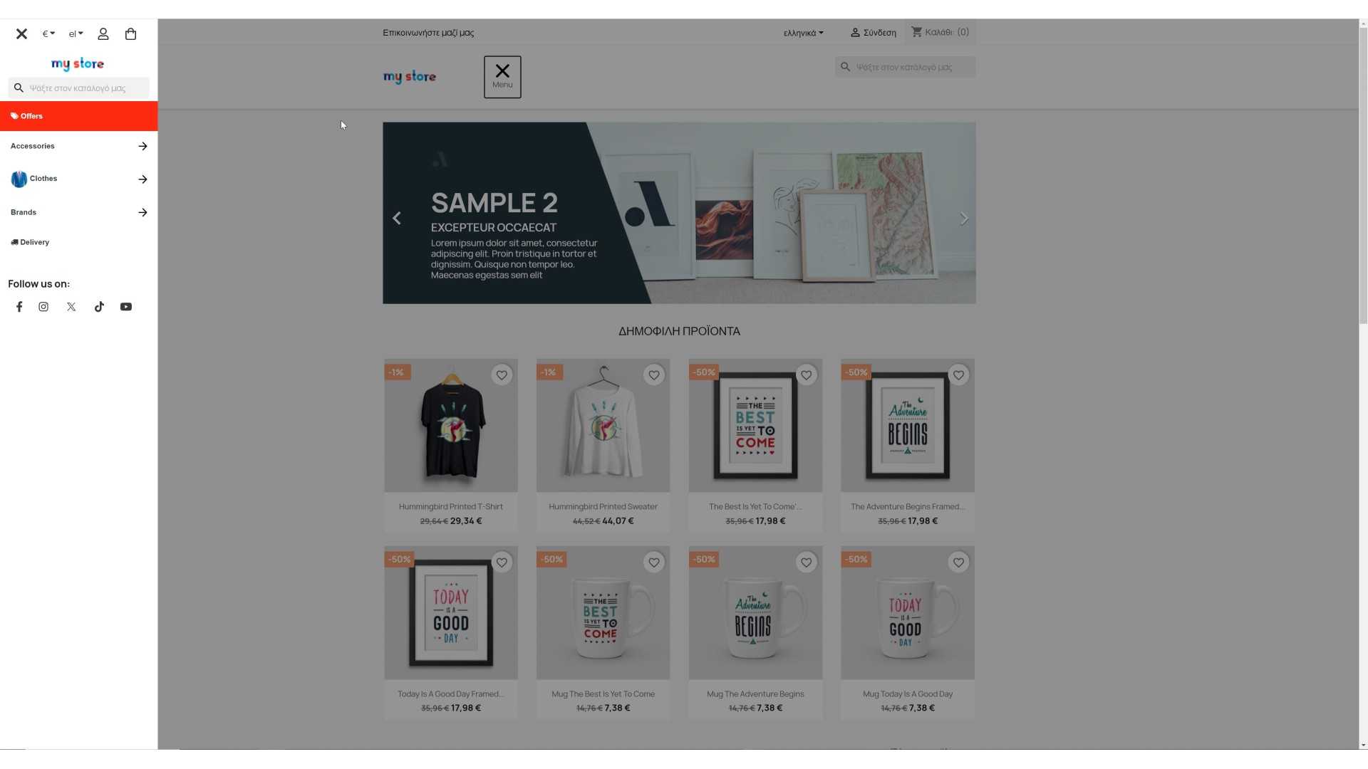
Our module brings a new UI/UX navigation to your customers. A multi level side menu designed mainly for mobile and tablet devices, but you can also use it for desktops if you like. Offer to your customers a better way to navigate to your PrestaShop.


 3 months Support
Click here for more information about addons support
 Refund within 14 days
Please read here our refund policy

Each purchase equals to one license of use, each license is valid for only one Store.
 Open Source Code
Our code is open source to all of our modules, plugins, addons etc
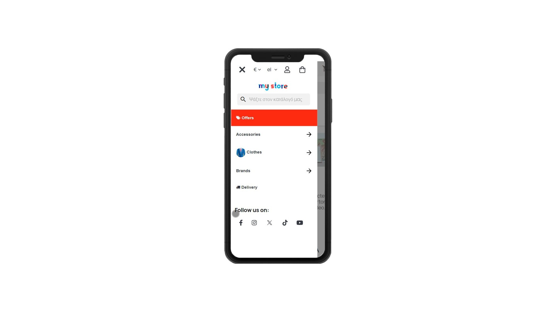
Our module is designed for the best navigation UI/UX for the mobile and tablet devices, not that it is not best for desktops too! Everything is considered to be available for the customer and navigate easilly to your shop.
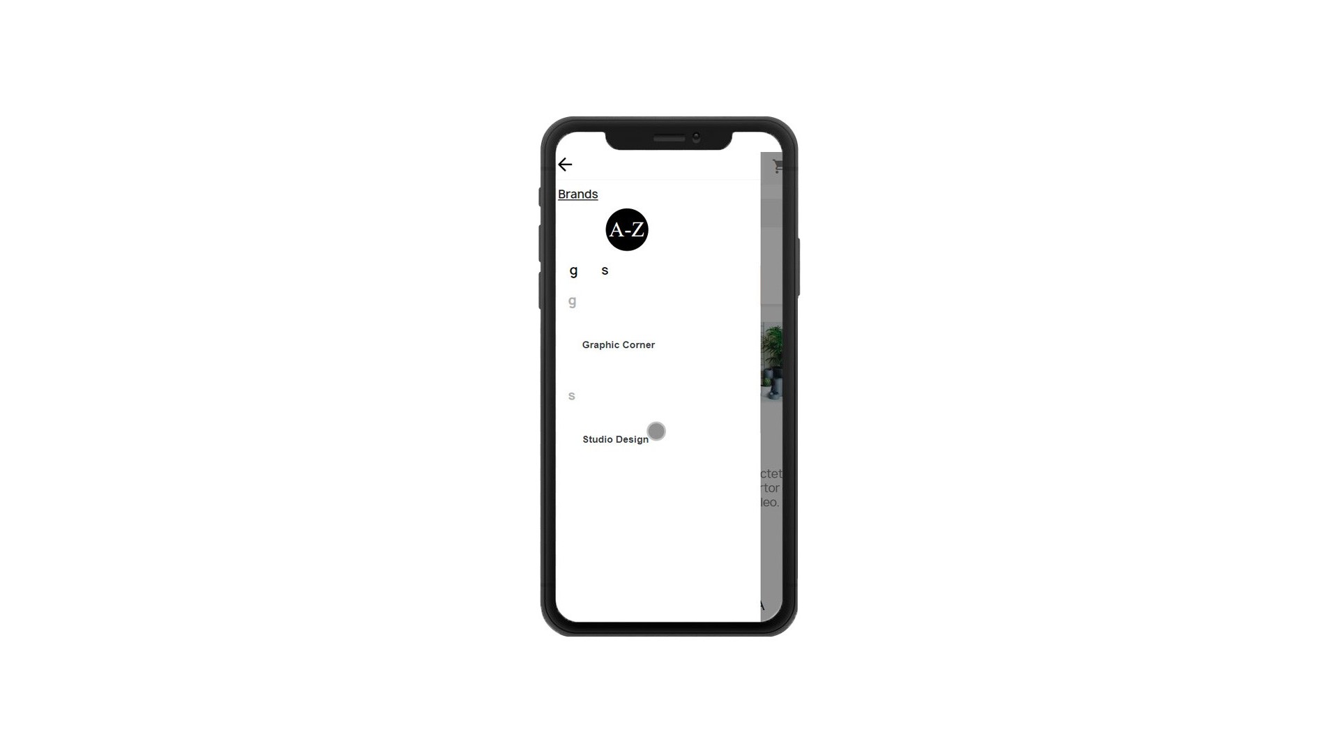
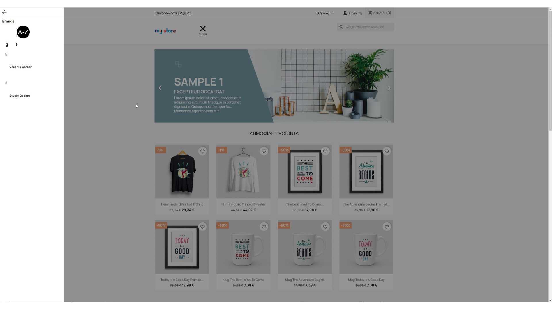
Brands item can help the customer a lot if you have a large number of brands. At first it lists the alphabet by the available and active brands you have, by clicking on a letter the menu is auto scrolled to the brands that the first letter is starting to the one the customer clicked.
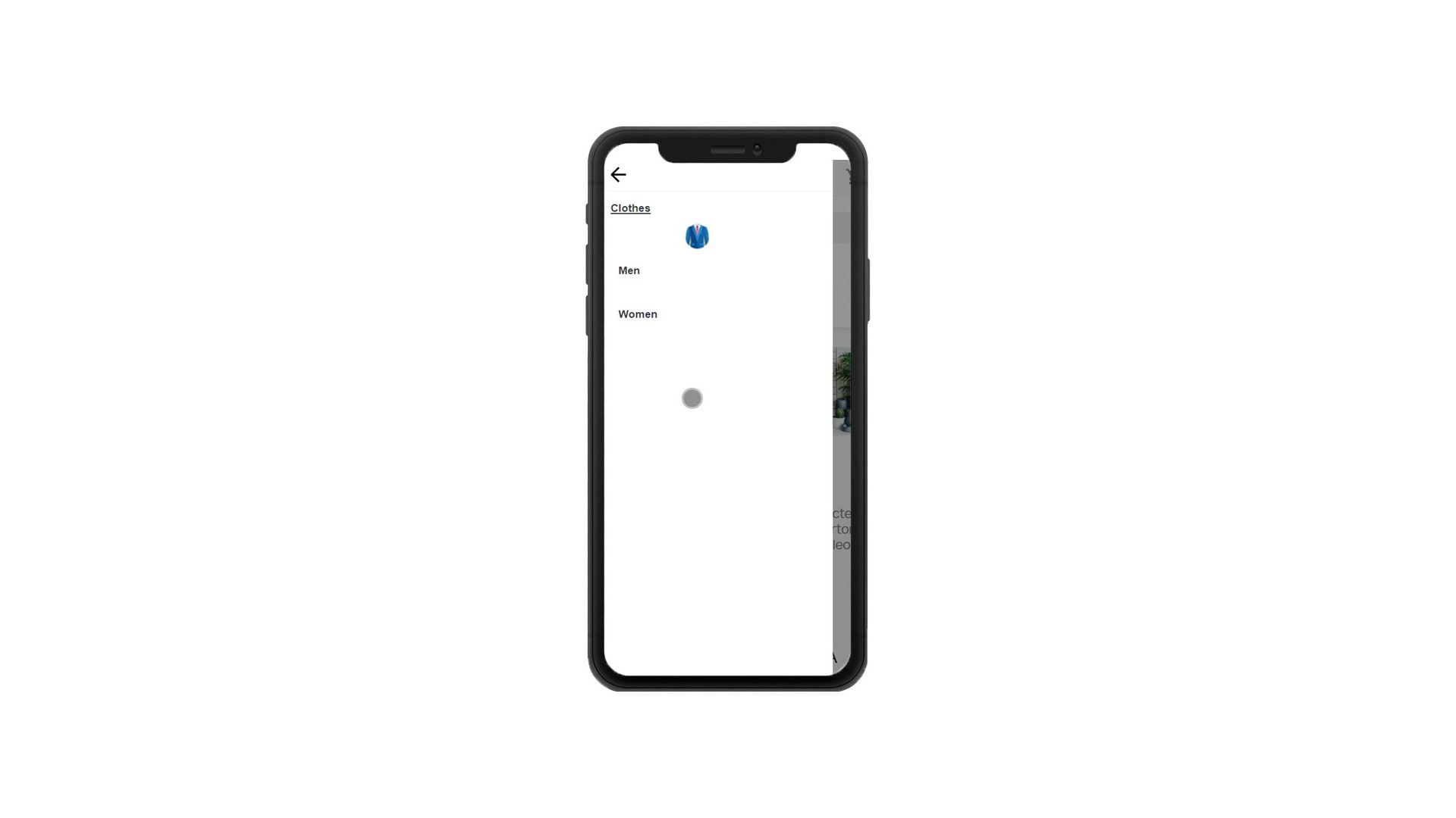
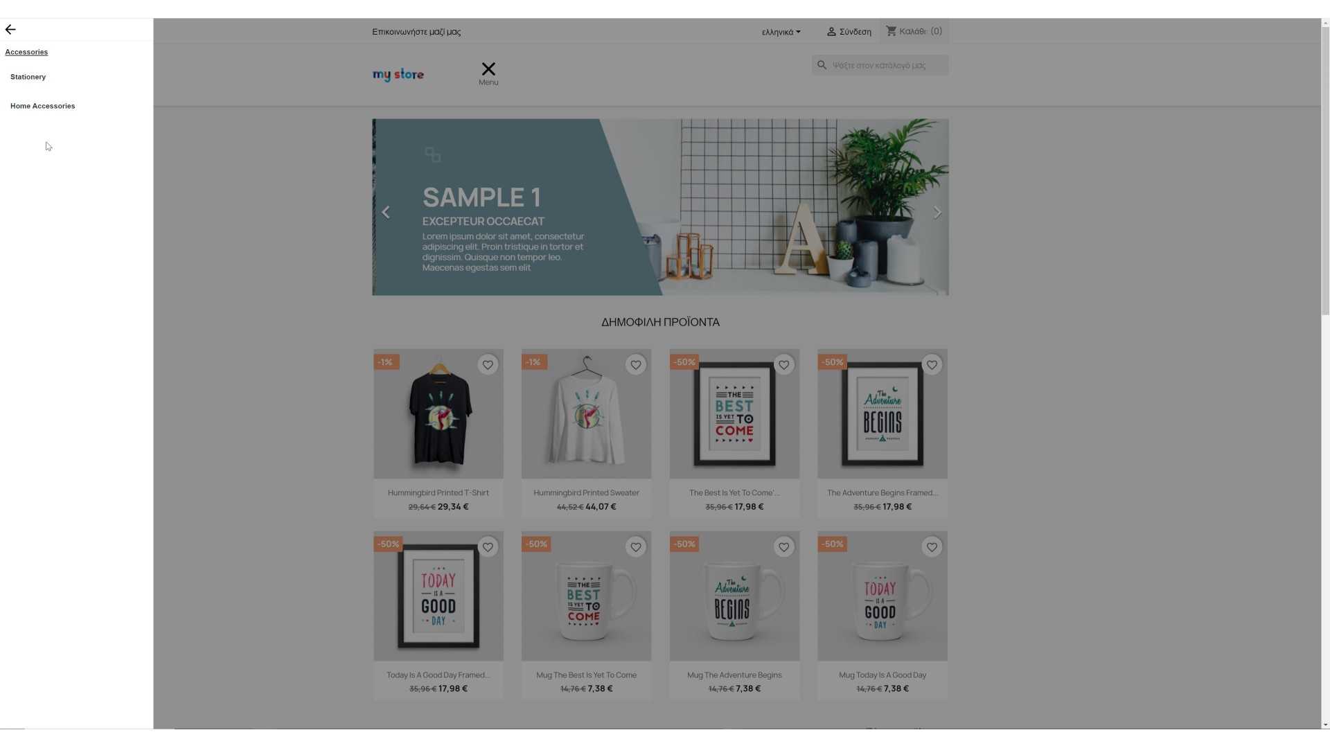
Categories that have sub categories are drilled downed, in other words when a customer clicks on a category having sub categories it will change screen and view the subcategories of the chosen category thus helping the customer navigate to your shop easy and fast.
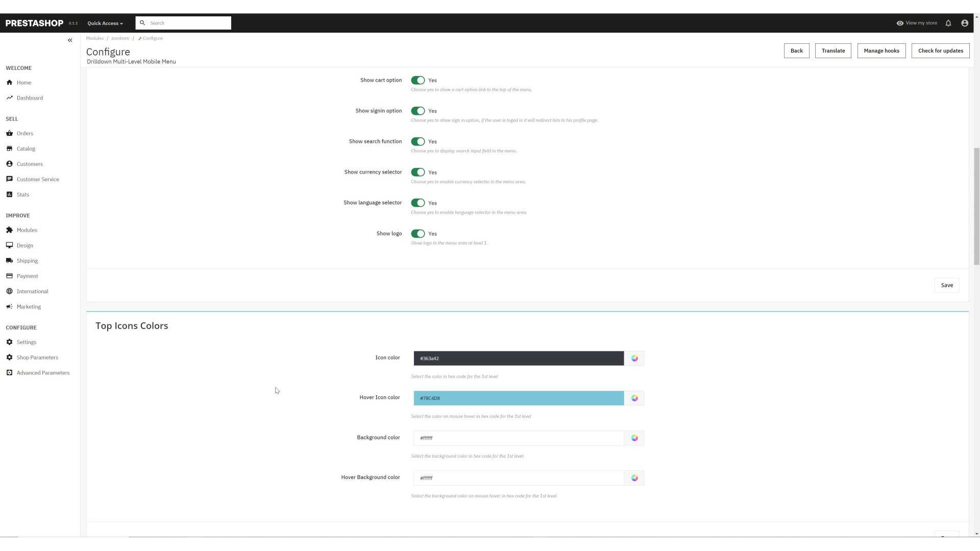
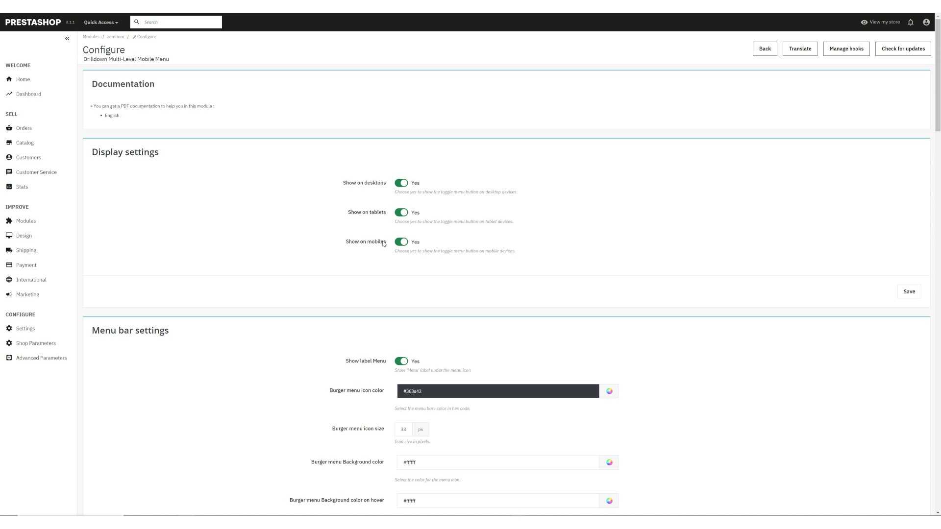
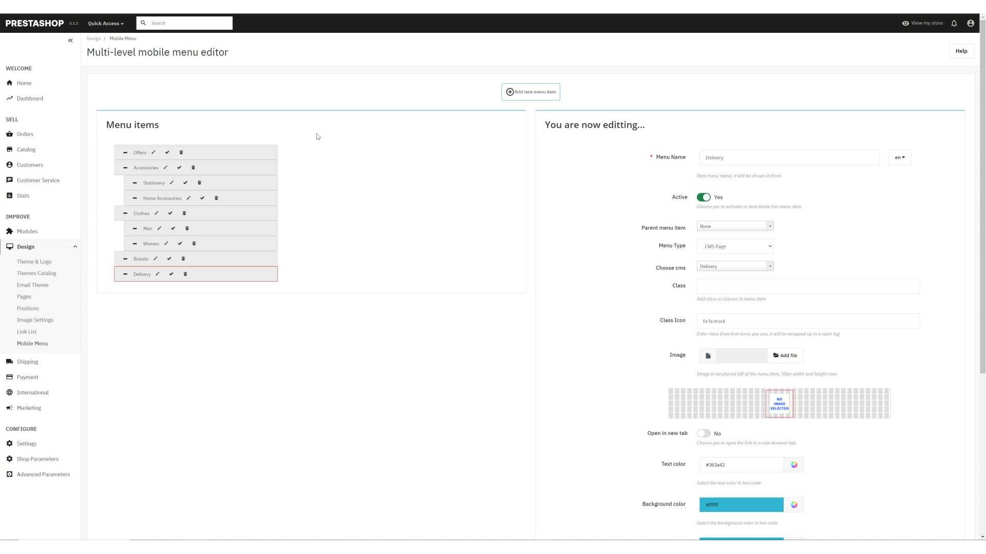
Installation is easy as any other PrestaShop module. You simply upload the downloaded file to your PrestaShop Module Manager and then configure it. To edit the front menu you navigate to Design -> Mobile Menu
Email: demo@demo.com
Password: demodemo
| Support | 3 months from the purchase date |
| Download Updates | Free download updates as long as you have active support |
| License | 1 license per domain |
| Current Version | v1.4.17 |
| Compatibility | v7.X v8.X v9.X |
| Last Update Date (MM/DD/YYYY) | 10/28/2025 |
PrestaShop Invoice choice, VIES...
This module adds a choice to the customer if he/she wants an invoice. A form with invoice data requests all the...